
Visual Authenticity & Aesthetic Logic
A Systematic Framework for Evaluating Replica Watch Visual Realism
1. Reframing Visual Authenticity: From Detail Matching to System Coherence
In replica watch evaluation, visual authenticity is often simplified into a question of similarity:
Does it look the same as the original?
This framing is fundamentally flawed.
Professional assessment treats visual authenticity as a system-level outcome, not the sum of isolated details. What matters is whether all visual elements operate within the same aesthetic logic as the original design—across distance, lighting, motion, and daily wear.
True visual realism emerges only when proportions, materials, color behavior, and finishing decisions align coherently rather than compete for attention.
2. Proportional Architecture: The Foundation of Visual Credibility
2.1 Case Geometry as a Visual Anchor
The human eye detects proportional imbalance faster than fine detail errors.
Key proportional relationships include:
- Case diameter vs. thickness ratio
- Lug length relative to wrist curvature
- Bezel height vs. dial opening
- Crown size relative to case flank
When these ratios deviate—even subtly—the watch loses visual credibility at arm’s length, regardless of engraving quality or dial sharpness.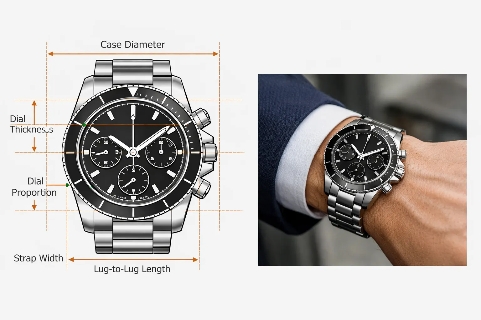
2.2 Wrist Presence vs. Measurement Accuracy
Exact millimeter measurements do not guarantee authentic wrist presence.
Professional evaluators observe:
- How the case “sits” rather than measures
- Whether the visual mass feels centered
- If the watch maintains balance during wrist movement
A visually authentic watch should disappear into natural wear, not constantly remind the wearer of its presence.
3. Dial Design Logic: Visual Hierarchy and Information Flow
3.1 Dial as a Structured Visual System
A dial is not a flat graphic—it is a layered information system.
Authentic dial logic demonstrates:
- Clear hierarchy between primary and secondary elements
- Balanced spacing between indices and complications
- Consistent alignment relative to the central axis
- Natural distribution of visual weight
When hierarchy breaks down, the dial appears crowded, empty, or visually unstable, even if individual prints are technically clean.
3.2 Negative Space as a Design Component
Negative space is intentional.
Original designs use empty areas to guide attention, control rhythm, and enhance legibility. Replica dials that ignore this balance often appear “busy” or artificially dense.
4. Color Logic and Light Behavior
4.1 Static Accuracy vs. Dynamic Stability
Color authenticity cannot be judged from a single image.
Professionals evaluate:
- Color depth consistency across lighting conditions
- Saturation control under direct and diffused light
- Hue stability when viewed at angles
- Interaction between dial color and hand finish
A visually convincing watch maintains its identity across environments, not only under ideal photography conditions.
4.2 Contrast Engineering
Contrast is functional, not decorative.
Authentic designs balance:
- Dial-to-hand contrast
- Marker visibility without harsh separation
- Lume integration that supports, not overwhelms, da ytime appearance
Over-contrasting elements may look striking online but degrade realism in real use.
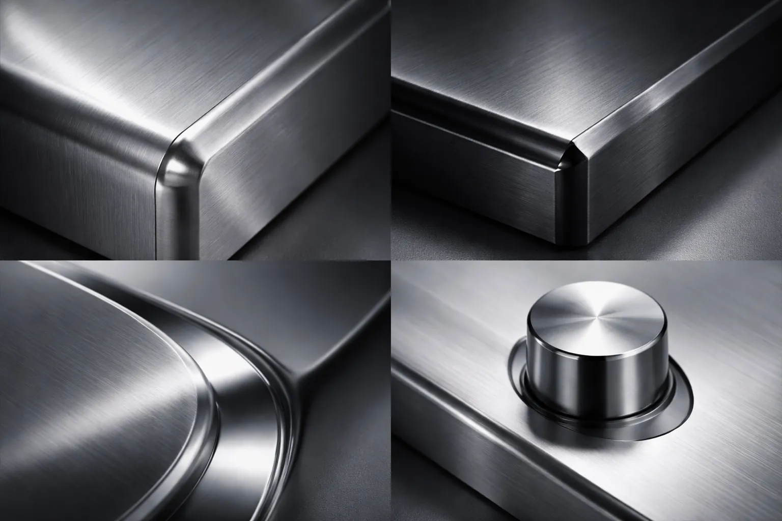
5. Material Perception and Surface Logic
5.1 Light Interaction as a Truth Indicator
Material realism is primarily judged through light behavior, not material naming.
Evaluation focuses on:
- Uniform brushing direction
- Smoothness of polish transitions
- Edge sharpness without harshness
- Reflection clarity without mirror exaggeration
Authentic finishing produces calm, controlled reflections rather than aggressive glare.
5.2 Surface Transitions and Visual Continuity
The eye follows transitions.
When brushing, polishing, and matte surfaces fail to transition naturally, the case feels fragmented—an immediate signal of aesthetic inconsistency.
6. Crystal Optics and Perceived Depth
6.1 Transparency Is Not Enough
Crystal realism affects how the entire watch is perceived.
Professionals examine:
- Optical distortion at edge angles
- Coating tone neutrality
- Reflection suppression without color shift
- Visual depth between crystal and dial
A correct crystal allows the dial to feel embedded within the case rather than pressed against the surface.
7. Typography, Indices, and Micro-Alignment
7.1 Micro Details as Structural Reinforcement
Typography does not lead authenticity—it confirms it.
Evaluation includes:
- Font weight consistency
- Stroke termination clarity
- Index centering accuracy
- Print integration with dial texture
When macro-level logic is correct, micro details strengthen confidence rather than distract from flaws.
8. Bezel Design and Functional Aesthetics
8.1 Bezel as a Structural Frame
Bezels frame perception.
Professionals consider:
- Numeral depth and spacing
- Insert material light behavior
- Alignment precision at reference points
- Rotational symmetry (where applicable)
A bezel that visually dominates or disappears disrupts overall balance.
9. Bracelet, Strap, and Integration Logic
9.1 Structural Continuity
Bracelets and straps must feel like extensions of the case, not accessories.
Key indicators:
- Natural drape and weight distribution
- Consistent surface finishing
- Seamless case junction
- Clasp proportional balance
Poor integration often reveals itself through stiffness or visual separation at the lugs.
10. Batch-Level Consistency and Aesthetic Reliability
10.1 Why Single-Sample Evaluation Fails
One visually strong unit proves nothing.
Professional judgment relies on:
- Repeated alignment stability
- Color consistency across production runs
- Surface finishing repeatability
- Absence of random visual anomalies
Stable batches signal controlled aesthetic logic rather than chance accuracy.
11. Visual Authenticity vs. Marketing Language
11.1 The Problem with Absolutist Claims
Terms like “perfect” or “1:1” ignore reality.
Authenticity exists on a spectrum and should be evaluated through:
- Visual coherence
- Predictability
- Wear-based realism
- Transparent limitation acknowledgment
A technically credible replica prioritizes realism over rhetoric.
12. Integrated Evaluation Framework (Professional Summary)
Experienced evaluators assess visual authenticity in layered order:
- Proportional structure and wrist presence
- Dial architecture and hierarchy
- Color stability and contrast behavior
- Material-light interaction
- Crystal optics and depth perception
- Typography and micro-alignment
- Bracelet integration and balance
- Batch consistency and predictability
Each layer reinforces or undermines the next.
Internal Reference Resources
For readers seeking structured extensions of this technical framework:
Closing Perspective
Visual authenticity is not achieved through perfection, but through coherent aesthetic logic executed consistently over time.
Understanding this distinction allows collectors and buyers to move beyond marketing noise and evaluate replica watches with clarity, realism, and technical confidence.


